Build Log

Behind the build

What we’re making, what we’re learning, and how Spine is taking shape, in our own words, as it happens.

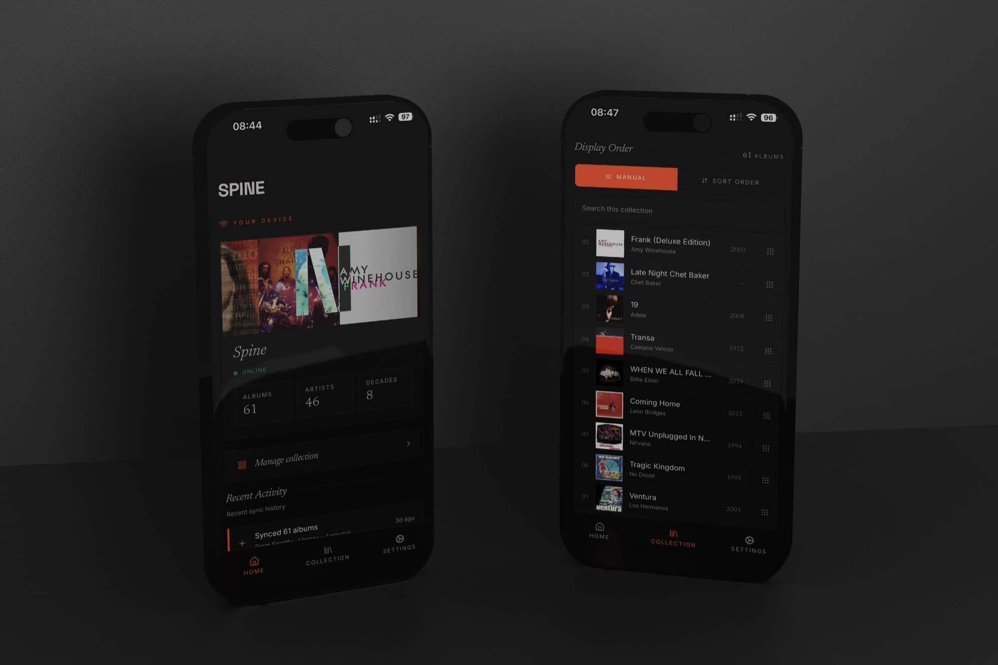
  1. Spine is now running on a real prototype display

    This is a big moment.

    After months of developing Spine, from paper prototypes to figure out the right proportions, to countless iterations of software on my Mac, we now have it running on an actual bar-format display.

    The hardest part was getting it to run perfectly smooth on the display and Pi stack. It required a full rebuild of the rendering layer in WebGL. The previous implementation handled most things fine but started to drop frames under load, and 60fps matters to me in a way that probably sounds disproportionate if you're not a gamer. I just could not settle for anything less than pure smoothness.

    It's part of what Spine is supposed to feel like, and once you've seen it running cleanly it's impossible to accept anything less. The WebGL switch fixed it. Scrolling through a full library now feels exactly as it should.

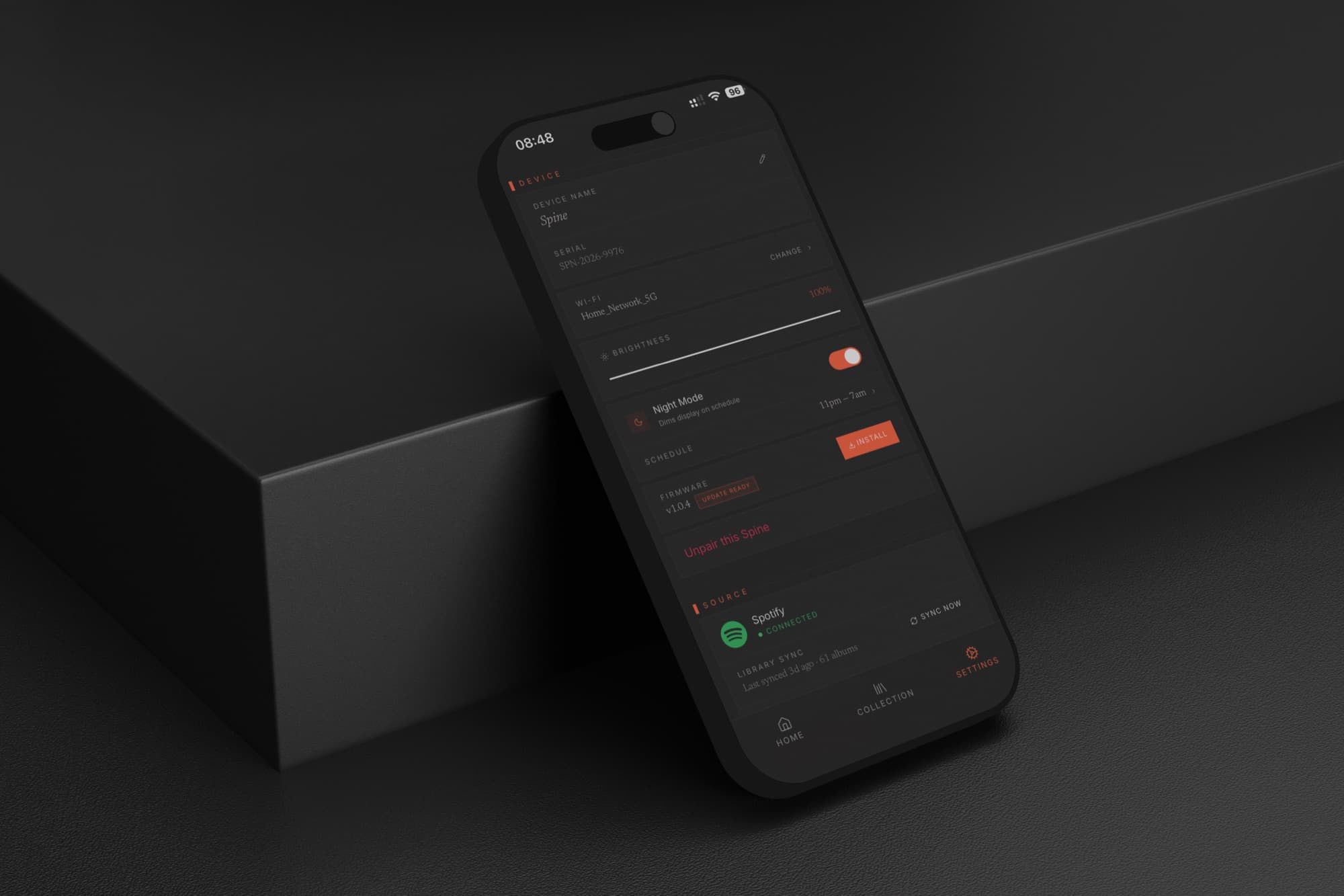
    Important caveat: what you see in the video is a development rig, not the finished product. Display and Raspberry Pi 5, nothing more. There's no anti-glare coating on the glass yet, so the screen still feels a bit too much like a screen.

    The industrial design work with Aetha is running as a separate stream and will look nothing like this. Expect something that makes you proud to hang on your wall, that behaves flawlessly and doesn't feel like a gadget. But the software behaviour visible here, the rendering, the scrolling, the cover art loading, the tap to play, that's what ships.

  2. The Spine Music app

    Two iPhones showing the Spine Music app: the Home screen with device status and a Spotify library of 61 albums, and the Collection screen listing the synced albums in manual display order.

    From the beginning, the vision for the display was to do one job really well: show your music collection, giving that physical feeling of having your music back on the wall, like a shelf. That meant little to no interface. So we needed to put all the complexity somewhere else.

    The app is where it lives.

    We built it native (iOS and Android) rather than as a web app. The reasons aren't philosophical. Tap-to-play, which we covered in the last post, requires a process running in the background, listening on the local network, ready to act. A browser tab can't do that. Once you follow that requirement honestly, native is the only answer.

    The app has two jobs. Manage the device. Manage the collection.

    Device management is the expected half. Connect Spine to your Wi-Fi network, switch streaming services, sync again when your listening changes. The display has a built-in light sensor, but sometimes you want manual control: brightness is adjustable from the app. Night mode drops the display to minimum for energy saving and won't light up the room while you sleep.

    Spine Music app Settings screen showing device name, serial, Wi-Fi network, brightness slider, Night Mode schedule, firmware update, and the connected Spotify source.

    Collection management is where it gets more considered.

    Spine shows your music as a continuous wall of album art. What appears on that wall, and in what order, is entirely yours to control. You can curate it by hand (drag, rearrange, put things where you want them) for anyone who arranges their collection by colour, or mood, or the logic only they understand. Sort by decade. Sort by most recently added, which makes the display reflect what you've actually been into lately rather than your entire archive.

    We looked hard at sorting by genre and record label too. Both work, but not reliably enough: metadata inconsistencies, albums that resist clean categorisation, labels with erratic tagging. We'll add them when they work for every collection, not just well-maintained ones.

    Filtering is the feature I use most. You can choose which albums show at any given time. Going through a jazz phase, show only jazz. Having people over, switch to the records you actually play for guests. Late night, a quieter subset. Spine updates the moment you change it.

    Most people have strong opinions about how their music should be organised. It was important to me that Spine actually respected that.

  3. How tap-to-play works across three streaming services

    One question comes up from nearly everyone who sees Spine (users and journalists alike): can you tap an album on the wall and play it?

    Yes. And building that meant solving the same feature three different ways, because Apple Music, Tidal and Spotify don't agree on how playback should work.

    With Apple Music, it's seamless. A tap on the Spine display starts the album playing through whatever the listener already uses at home: a Sonos system, or anything else. No phone in hand, no second step. That's possible because Apple's framework treats playback as something that can move to another device: the same machinery AirPlay rides on. Spotify and Tidal don't see it that way. For them, playback stays bound to the app session that started it, and a wall display isn't that session.

    So Tidal and Spotify work differently. A tap on Spine sends a notification to the listener's phone; they press play there, and the album starts. One extra step.

    That extra step was a decision, not an oversight. The honest options were a notification hand-off or no playback at all on those services. And a tap that takes one bounce through your phone beats a tap that does nothing. If Tidal or Spotify open up the way Apple has, Spine's behaviour changes with it.

    Spine was never built to be a speaker. Sound comes from the equipment already in the room. What Spine adds is use: a wall of album art that responds to touch.

    And the part that made the work worth it: watching someone sync their library, tap an album they love, and just light up. Tap, play, a smile. Building this, I did not once get tired of pulling up The Doors, or Caetano Veloso, or Adele, and hearing a room change.

    Next: the software running on the real display.

  4. Aetha is our industrial design partner

    Aetha Design portfolio piece

    We officially signed Aetha Design to be our industrial design partner.

    Aetha is a boutique Dorset-based studio founded by Tom Parsons. Tom spent years at Dyson before Aetha, and has successfully launched his own Kickstarter campaigns in the past. Their portfolio spans a wide range of carefully crafted products, from Lofone (a minimalist phone for the digital detox culture) to Alice Camera (a precision-CNC aluminium camera for content creators), among other shipped work.

    I spoke with multiple studios. Aetha got Spine immediately. The portfolio sits exactly where Spine wants to live: considered, understated design, precision craft, shipped. Tom's been through Kickstarter himself, so he understands what the months around launch actually look like for a solo founder. And the chemistry on the call was right. Three things I needed in one place.

    The hope is that the partnership extends well beyond launch. Tom's Kickstarter experience and manufacturing network are exactly the kind of compounding value that turns a design contract into a long-run relationship. Day one is the design work. Where it goes from there is a longer conversation.

    We're excited to get into the details of the industrial design.

    Onwards.